Chart Formatting, part 3
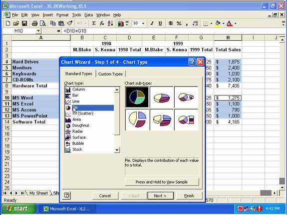
Here we have selected the cells to use in the chart, clicked the Chart Wizard button, selected the Standard Types tab, clicked Pie (in Chart Type), and we are going to select Pie With 3-D Visual Effect (second on top row) in Chart sub-type, then click Next …
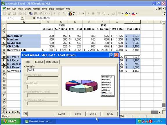
… on the third step of the wizard we are adding a Chart Title, then clicking Next …
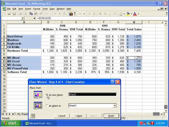
… then selecting As New Sheet (under Place Chart) and clicking Finish.
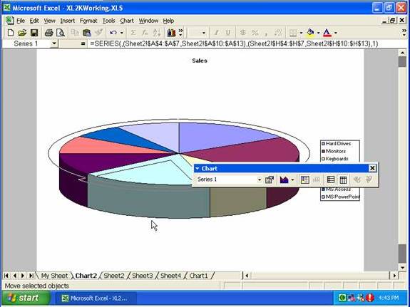
If you click once on the front pie slice and drag it out (forward) a bit you’ll see this opens them all up …
… but clicking and pushing on that front one will push them back in together.
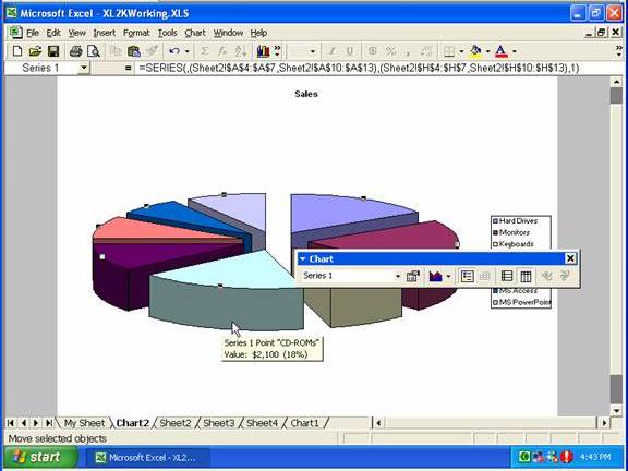
If you then click again on the front slice it will select that one only, and then you can pull that one out a bit.

From the Chart menu you can select Chart Options …
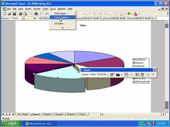
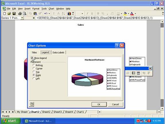
… and change the title for the chart on the Titles tab, or go to the Legend tab and uncheck Show Legend or select a different position for the legend …
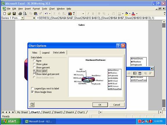
… or use the Data Labels tab to display the kind of data labels you want.
You can also make changes directly, such as by clicking on the legend and pressing the Delete key (to remove the legend)
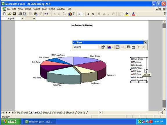
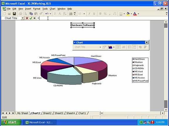
You can link back to a worksheet, such as by selecting the main heading, clicking in the formula bar, and typing the equals sign …
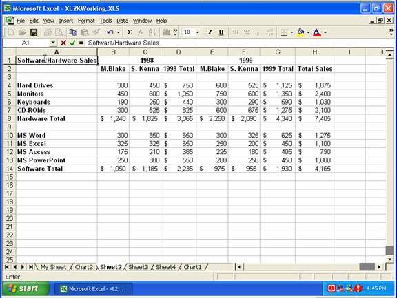
… then clicking on the tab of another worksheet and clicking on a cell with the text you want for the heading and pressing Enter.
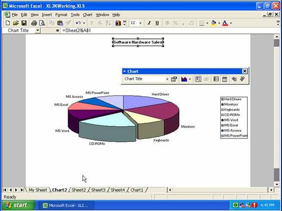
Here’s the heading displaying the text from the other worksheet:
If you click just outside the pie chart to display the outline box, you can drag the handles to resize it, or move it around on the page.
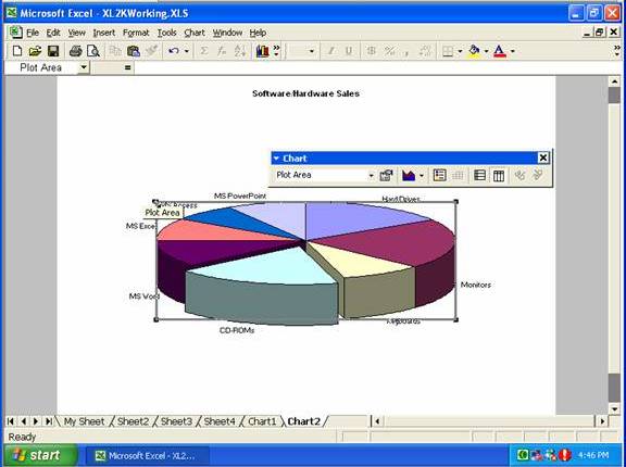
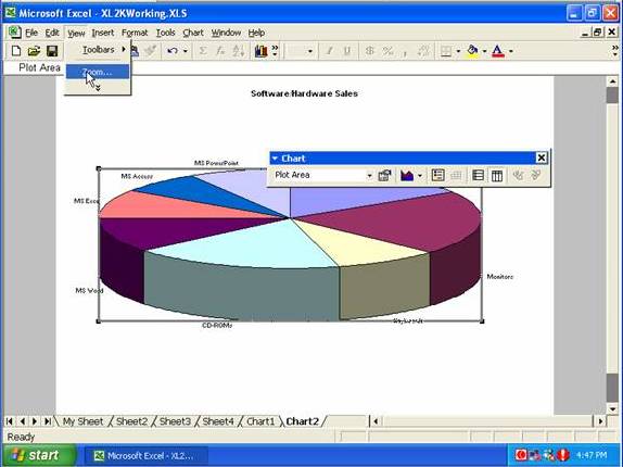
To change the magnification, go to the View menu, and select Zoom …
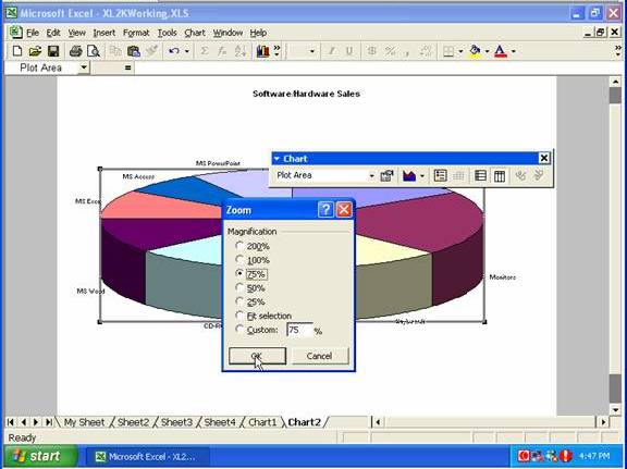
… select the magnification required, then click OK.
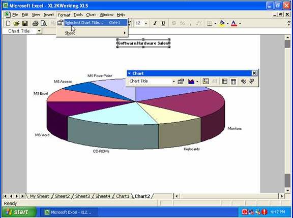
If you select the chart title and go to the Format menu, one of the options will now be Selected Chart Title …
… which opens a window where (among other things) you can add a border to the title …
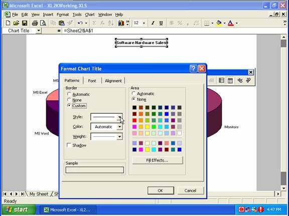
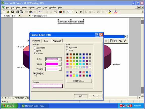
… and add a Shadow to it.
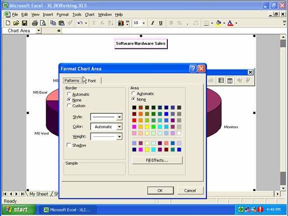
If you double-click on the white area of chart you’ll open the Format Chart Area window …
… from which you can select font types and sizes for the chart as a whole.
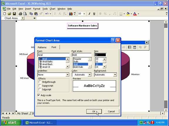
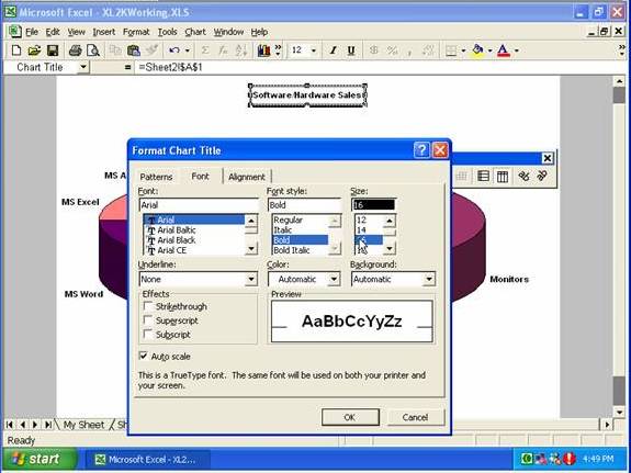
However, if you make such changes you might need to double-click on the main heading, and set the font size for that, so it stands out from the rest.
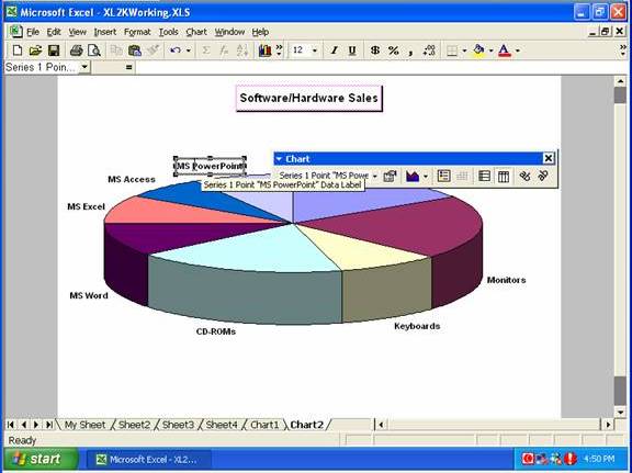
You can select an individual data label by clicking it twice slowly (two separate clicks, not a double-click) …
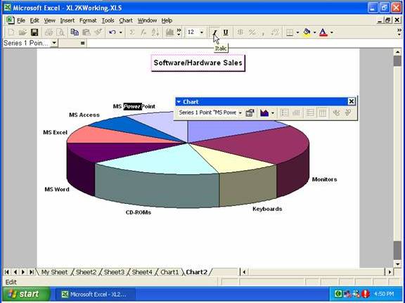
… then you can apply specific formats to that data market (or even a part of that data marker).
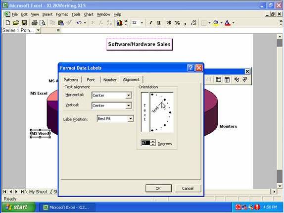
If you double-click on a data label and go to the Alignment tab, you can change the orientation of that data label..
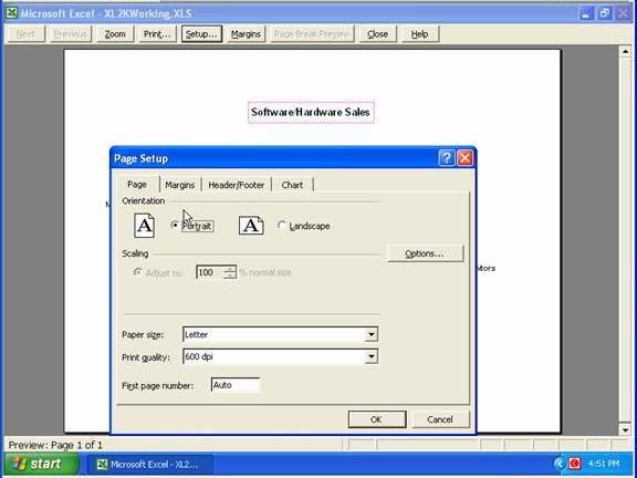
By clicking the Print Preview button, clicking Setup, then going to the Page tab, you can select whether to display the chart in Portrait or Landscape orientation.
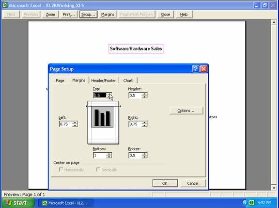
From the Margins tab, you can change the margins or select to ‘Center on page’
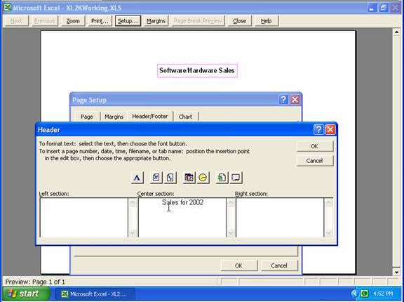
From the Header/Footer tab you can set up a header and/or footer for the chart.
Copyright www.LaraAcademy.com